Welcome

Welcome to my blog. Here you will find research and planning, construction evidence, and evaluation for my AS foundation portfolio.

Monday, 16 April 2012

Evaluation Question 7 - Looking back at your preliminary task (the school magazine task), what do you feel you have learnt in the progression from it to the main task?


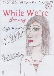
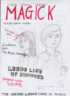
My research and planning has improved greatly, from my prelim to my final product. I only went through 3 steps for my prelim magazine. The first was looking at a range of magazines, then producing my flat plan, and then creating my final product. However for my final product I did a lot more research to make it look as proffesional as possible. With the music magazine, I still had to make a flat plan to give me a rough idea and help with creating my final product. As well, the magazines that I researched were all the same genre as my target audience which again, helped me to create a proffesional looking final product.


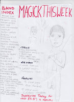
My flat plan for my college magazine cover in comparison to my music cover has less detail and sell lines, however I kept both with a simple colour scheme. As well I think that my "while we're young" magazine looks a bit plain and too simple to be a proffesional product.

In terms of research and planning, for my music magazine I researched into what type of fonts would work well for my masthead, sell lines and article which would go along side the chosen genre, along with colour chosen to again link in with my audience. 

Shown is a screen shot of my masthead research with the second title being the one that I chose. For my photographs I had to chose costume, make-up, hair and setting which would help to make the representation of a certain steriotype stand out and to do so I had to re-create one of my models to fit the chosen audience being indie rock. Although, for my prelim I didn't do so. 

In terms of planning, I had to go through several stages before completeting my product thes included: location reece, photo shoot planning, photo shoot test shots, model release forms, hazard assessments, article research, article drafting and then to go onto  the construction part of the magazine. Where I had to find suitable models that fitted my genre, then take photoshoots and edit persific photos that I wanted to use on my cover, contents and double page spread. 
This process has built up my computer and technology skills, meaning I can now produce a suitable magazine that can show clearly the rock/indie genre.

In terms of management, we had three weeks to start and finish the prelim task, however because I spent a lot of time drawing and researching I was rushed near the ending. The deadline made me push myself to meet it and do ti to my best ability. Although we had three weeks again to finish out main product, the software's were harder use for example the photo's had to look even more proffesional, meaning they had to be edited which was difficult. 

Friday, 30 March 2012

Question 6: What have you learnt about technologies from the process of constructing this product?

From the construction of my magazine, I have learnt how to use a Apple Mac, and how to use software packages such as Indesign, photoshop, goanimate and Prezi. From using Photoshop to create my magazine cover, it allowed me to layer objects such as the sell-lines on top of the image. Indesign was a better software to create the contents and double page spread however, because it allowed me to line things up correctly and type the article without too much difficulty.
   As well, I have learnt how to use a proffesional camera as shown in the photo, I had to learn ow to change the settings, the flash lights and also learn things such as the focus and zoom to be able to get realistic photographs for my magazine cover. This also helped me to create the image targeted to my chosen audience from the different backrounds and choice of model.

Thursday, 29 March 2012

Question 5: How did you attract/address your audience?

To receive primary feedback, we filmed short clips and asked class mates the following questions:
  • What draws your attention to the product?
  • What genre is it and how do you know?
  • What do you consider are the strengths of the product?
  • What social groups does it represent and how?
  • Would you purchase the product and why?
  • How would you improve the product?

The feedback that I received from primary research told me that audiences think that the main images grab attention to the magazine, the masthead is unique and sell lines draw further attentions. the genre is indie/rock, seen font he colour scheme and the images are indie from the clothing and makeup. the strengths are the images and the contents, making it easy to read. the social groups it represents are teenagers and indie. They would purchase the product, and they would improve this product by adding text the the top banner on the contents page as it looks bare and the font is a bit basic.


After I did my rough cuts, I realised that I preferred a single image of a female on the front of my magazine, this is because on the shelves in a store the images are mainly focused on males, so I wanted to show that it was for both genders, also by adding a picture of both genders on my contents page. I have kept with the idea of having my sell-lines along the left side on my front cover, I think that it break it up and makes it looks unique. 


GoAnimate.com: question 5 by amy.scowen

Like it? Create your own at GoAnimate.com. It's free and fun!

Monday, 26 March 2012

Question 4: Who would be the audience for your media product?

Following secondary research in the initial stages of my project, I found the audience of 17-22 males and females were mostly interested in attending gigs, parties, fashion and socialising. This information was based on magazines such as NME and Q who have a similar style of magazine as the one I aimed to design. They were hugely interested in the areas surrounding: music - such as gigs; socialising - such as partying; and fashion amongst other similar aspects. Their music tastes vary, however, indie music is a major one.I then conducted primary research which suggested that the people used in my research thought the example magazine Q was aimed at people aged 18 - 25, and focuses on a wide-range of music genres.Therefore from my research, the audience for my media product would be someone who fits into - but not limited to this category.


<iframe frameborder="0" height="1300" marginheight="0" marginwidth="0" name="glogster-embed-glog" scrolling="no" src="http://www.glogster.com/glog/6lk0crajmfpudt8e1r83na0" style="overflow: hidden;" width="960"></iframe>


Question 3: What kind of media institution might distribute your product and why?

Question 2: How does your media product represent particular social groups?

this video shows the groups represented in my product, it shows bands and images that are linked to the chosen genre.

Evaluation Question1: In what ways does your media product use, develop or challenge forms and conventions of real media products?