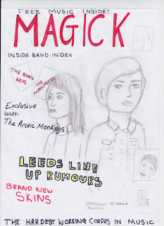
To receive primary feedback, we filmed short clips and asked class mates the following questions:
- What draws your attention to the product?
- What genre is it and how do you know?
- What do you consider are the strengths of the product?
- What social groups does it represent and how?
- Would you purchase the product and why?
- How would you improve the product?
The feedback that I received from primary research told me that audiences think that the main images grab attention to the magazine, the masthead is unique and sell lines draw further attentions. the genre is indie/rock, seen font he colour scheme and the images are indie from the clothing and makeup. the strengths are the images and the contents, making it easy to read. the social groups it represents are teenagers and indie. They would purchase the product, and they would improve this product by adding text the the top banner on the contents page as it looks bare and the font is a bit basic.

After I did my rough cuts, I realised that I preferred a single image of a female on the front of my magazine, this is because on the shelves in a store the images are mainly focused on males, so I wanted to show that it was for both genders, also by adding a picture of both genders on my contents page. I have kept with the idea of having my sell-lines along the left side on my front cover, I think that it break it up and makes it looks unique.
Like it? Create your own at GoAnimate.com. It's free and fun!


No comments:
Post a Comment